Every picture tells a story. Sometimes it’s a story well-told, and sometimes not.
Just as a writer carefully maps out the setting, the plot, and cast of characters long before he/she begins typing a novel, visual story-tellers–those who make images instead of books–also will previsualize the story they want an image to tell. Previsualization begins when we find or stage a subject that we believe has inherent artistic potential–i.e., has a story to tell–and leads to a point in time when we actually act on that belief by taking its picture or beginning to sketch on canvas.
In photography, previsualization is no less important than it is to any method of image-making. Often our eye will catch something we think has promise, but then we must exercise thoughtful previsualization to make the most of the story in front of us. In fact, previsualization must start with the story we want to tell, and all other compositional decisions we make should support that story.
One of the most important compositional decisions a photographer makes during previsualization is whether the final image will be in color or in B&W.
One good reason to decide on B&W film capture is the creative flexibility that B&W film lends to the photographer. If I can exploit this flexibility, I want to do that. Use of color subtraction filters and the ability to adjust film development to increase or decrease the contrast of the captured image are both good reasons to select B&W film over color film. Color film offers far fewer, if any, creative controls.
But first and foremost, the choice to use either color or B&W film should be based on the scene in front of the camera and what the photographer wants to say about that scene. In other words, does the presence of color support, or does it detract, from the story you want this scene to communicate? This is a question that is just as applicable to digital capture as it is to film capture, and it should be asked during previsualization.
It is so easy to defer the question of “color or B&W?” when shooting in color only, such as when shooting with a digital camera. Since the digital camera always captures the full color spectrum, the tendency is to just capture the scene and worry about converting to B&W later and see which, color or B&W, “looks best.”
This could be a mistake, regardless of whether you’re capturing to a digital sensor or onto film. The reason it’s a mistake is because you’ve also deferred the critical question: “Does my concept for this scene–i.e., the story I want to tell– require color? Does the color in the scene support or does it detract from that story?” When shooting film specifically, deferring this question until later also means that by choosing to use color film, you have removed any opportunity to exploit the creative advantages that B&W film offers.
I follow the advice of the greats who came before me and try to nail down the story for every photograph I take long before I load the film into my camera and click the shutter. Nailing down the story is the first, and perhaps the most important, part of previsualization. The story not only affects the choice of color vs B&W, but also where to point the camera, choice of lens, and every other aspect of composition. I repeat, being in color or being in B&W is one of the strongest compositional decisions to make: it should be made during previsualization. You should know before you take the picture whether it should be B&W or color.
Deciding on color or B&W is an intuitive decision, and I admit that sometimes, I don’t trust my intuition and will capture the same scene onto both color film and B&W film. Most of the time, I learn that I should trust my intuition more.
Here’s a case in point:
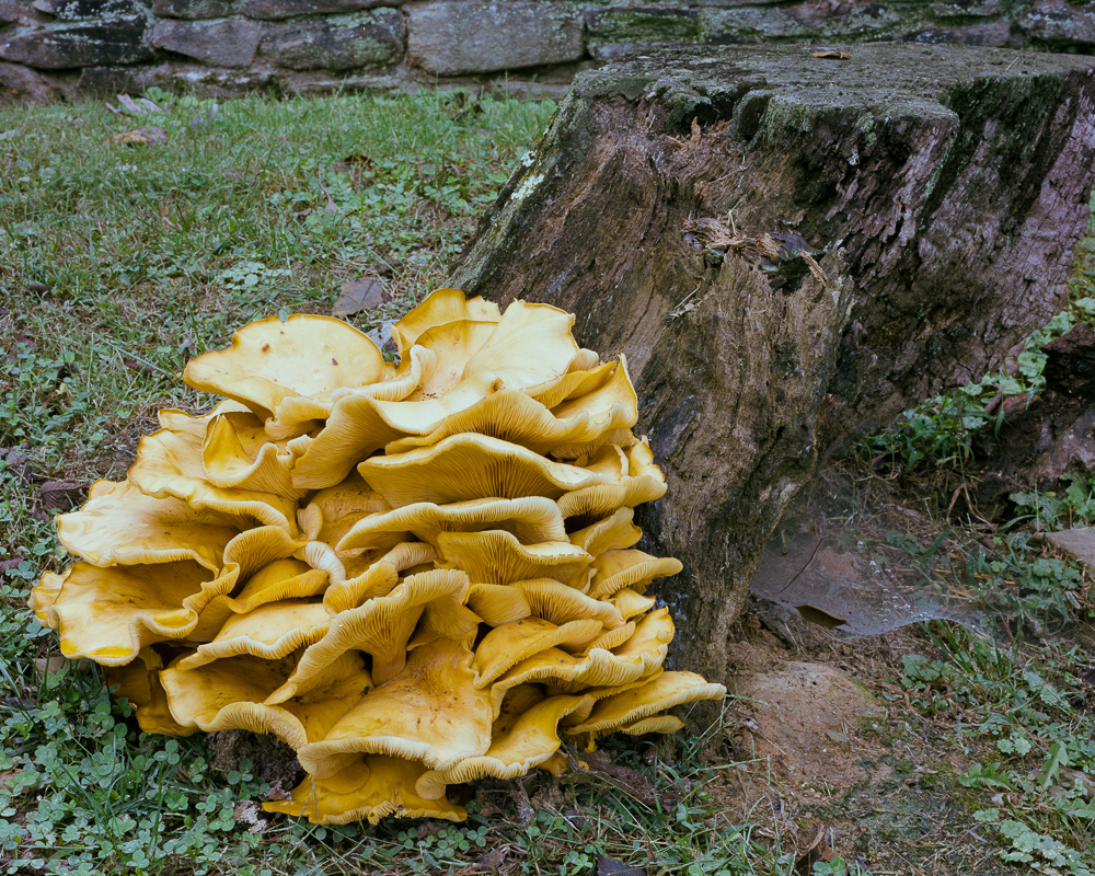 I came upon this massive mushroom this week while out walking on a local farm. It was more than 2 feet in diameter and rested in a bed of clover just at the base of an old dead tree stump.
What was immediately obvious was just how obvious this old mushroom was. It’s size and texture of course made it stand out from everything around it, but it’s color was intense as well. The yellow and orange hues really made it ‘different’ from the cooler greens of the surrounding grass and ivy, and from the old monochromatic stump. The impression I had, and this became my concept for this scene, was “Being Obvious.”
From that point on, my single goal in taking its portrait was to support the concept of ‘being obvious.’ My intuition told me that it should be a B&W portrait, and by using a pale yellow filter I could enhance separation of the main subject from its surrounding cooler tones quite well. But its mushroom’s color was so intense that I began an inner argument with myself (i.e., with my intuition) that then caused me to take the portrait in both color and in B&W. Both portraits were taken in similar, flat overcast light.
The color portrait is interesting because of the subject, but I think it lacks balance, and the colors present in the scene seem to detract from the story of the mushroom “being obvious. The intense yellow/orange of the mushroom tends to share the space almost equally with the other two major colors: the blue green ivy and the brown stump. In other words, the natural colors didn’t support my concept very well, even though intense.
I was glad I followed my first inclination and also took the mushroom’s portrait using B&W film. I chose to use a light yellow filter to deepen the tones of the cool green clover and lighten the tones of the fungus, thus exploiting the creative controls possible with B&W film.
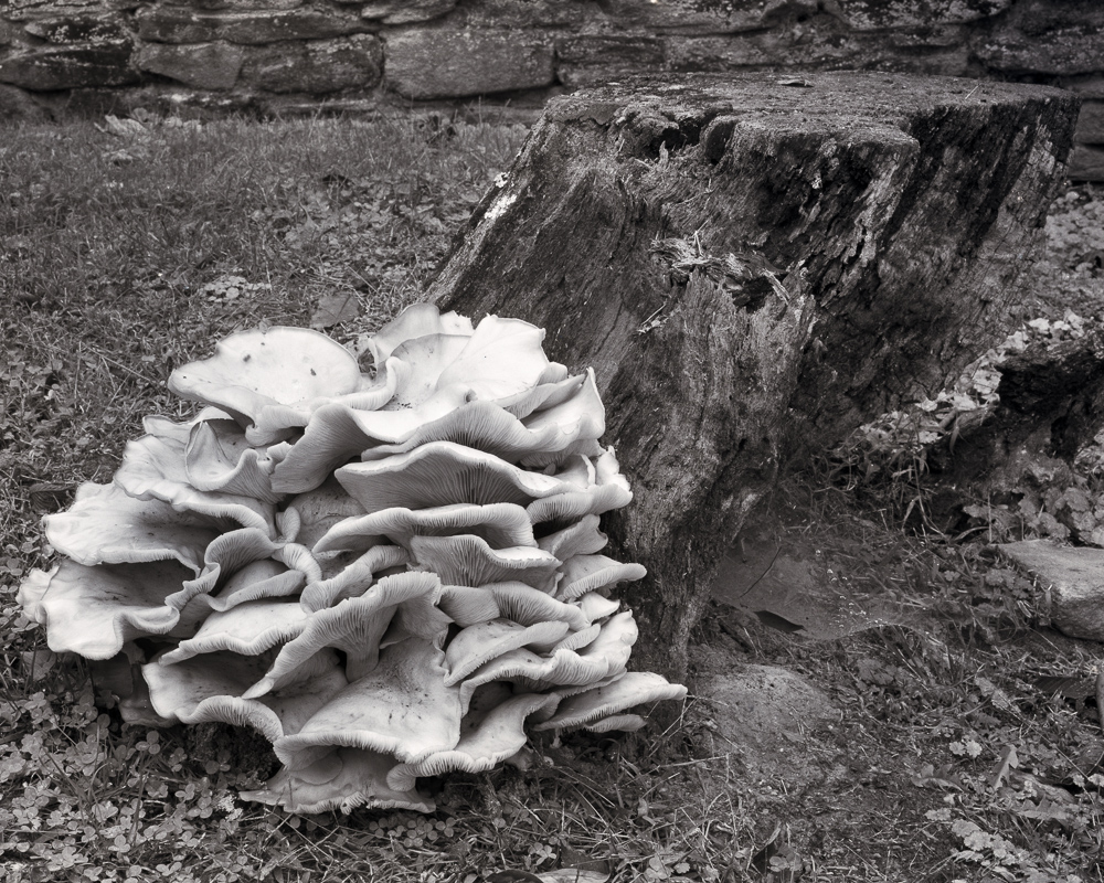
The B&W portrait better segregates the mushroom from all other elements in the image; the ivy and stump are no longer competing for attention with the mushroom, and this change better supports my ‘being obvious’ story. The B&W image also is better balanced than the color portrait, as I was easily able to lighten the tones on the far right of the frame to create that balance. Brightening the same green ivy in the color photograph would not have accomplished the same result.
Had I not previsualized this scene and just took the pretty picture of the mushroom without thinking, I might not have even thought to “see” this in monochromatic B&W, and would have failed to tell the best story for this fantastic, and worthy, subject.
Which do you prefer? Does this picture say something different to you? Would you have captured this portrait in color or B&W?
Leave a comment below!